Small Production Means Big Design on Wine Labels
 The art of wine label design is widely practiced. And better by some than others.
In almost every case, the primary question that is asked by the  owners of a wine labels is this: Will it help me sell more wine? What's really interesting about label design is that the less wine a label is supposed to help sell, the more creative and idiosyncratic that label is likely to be. On the flip side, the more wine a label is supposed to help sell, the higher the likelihood that the label will appear generic.
Though this is not a hard rule, it is a fast rule.
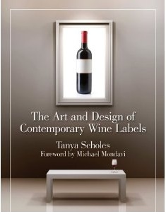
This principle was never more clear than in the recently released "The Art and Design of Contemporary Wine Labels", a beautifully designed, structured and produced coffee table sized book that profiles some of the more interesting, provocative and beautiful wine labels in recent years.
The vast majority of the wine labels highlighted by Tanya Scholes in her new book portray the identity of small production wines. As a result, the readers is introduced to some of today's most fascinating and creative works of art on a cylindrical object.
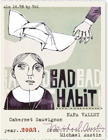 Labels representing more than 200 wineries from across the globe are offered on page after page, with each winery's story told under the label. The label designer as well as the winery is indicated along with web pages for each and other vital information about the producer. However, the one thing that is missing is the number of cases of wine that each label carried with it into the marketplace. Had this information been presented, my thesis about creative vs. generic designs would have easily been confirmed.
In most cases, what distinguishes labels of high production wine is  simplicity and clarity. These wines carry labels that clearly indicate the brand and variety and/or region. It should be obvious why this is the case. Wines of high production are required to stand out in a particular setting: a retail shelf. In a retail setting, the key aspects of choice come down to price and style (variety or region). After a consumer uses these parameters to narrow their choice, then any number of factors come into play determining their final choice. Among those factors is the label.
 A widely marketed wine must first have a label that clearly indicates producer and style. After that, the primary asset of a label on a large production wine is that it does not offend. This isn't too difficult to achieve. But it means too that the designer can't go too far off the rails and find themselves profiled in "The Art and Design of Contemporary Wine labels—though some beautifully simple and small production wines are profiled there. And to prove the contrary, there are a very few high production labels also profiled.
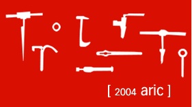 However, designers that are tasked with designing a label for a wine likely to be sold out of a tasting room,
  off a high-end wine list or to a wine club and that is in very limited supply (read: much easier to sell out of) are welcome to go off the rails. Few of the limitations and requirements of conservative convention apply.
Perhaps the best American example of what I'm talking about is Sine Qua Non. The stylistic etchings of sometimes disturbing and other times opaque subject matter depicted on the labels wouldn't pass the the first encounter with consumer testing…and for good reason. They would not work on the shelves. But…They sure are fun to look at and ponder.
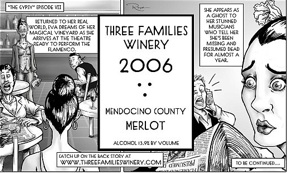
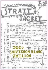 Other examples of American wines that needn't worry about appealing to a mass market and can therefore get a little more interesting and tricky with their label are The Cost Vineyard, Three Families Winery, Bridesmaid, and Michael Austin Wines.
The Art and Design of Contemporary Wine Labels comes with a foreword by Michael Mondavi, as well as two essays by Ms. Scholes, one on the history of wine labels and one on their current state. However, the vast majority of the book is given over to the discovery of wine labels.
As do most books that highlight contemporary graphic/packaging design, this one is going to serve as inspiration for those charged with designing a new label, be they label designers or new winery owners. And the book is tremendously well suited for this purpose. But more generally, this book is an outstanding glimpse into the currently state of affairs and thinking and direction of those who have thought outside the box where label design is concerned.
This new compendium of wine labels is HIGHLY recommended.
The Art and Design of Contemporary Wine Labels, By Tanya Scholes
Publisher: Santa Monica Press (2010) $45.00 (see Amazon Price!!)

Great post, Tom. We’ll be buying this book (through your Amazon link) very soon. I’m curious if it featured any paperless labels (screen printing, etching, decals) as contemporary labeling techniques. We can confirm that there are a number of smaller wineries stepping outside the box and screen printing value wines. It’s a lot of fun to see – and we love printing creative labels.
I wonder to what extent the reputation (and popularity) of a winery impacts the decision to create a bold, impactful label. The philosophy may exist that well known wines need very little in the way of label design. Is standing-out irrelevant when you’re already sought-out?
What a great idea for a book! I know when I make my wine at home I become obsessed with what the label looks like. But then, I a nerd that way.
Further:
http://www.graphicdesignforum.com/articles/logos_rand.htm
“the primary question that is asked by the owners of a wine labels is this: Will it help me sell more wine?What’s really interesting about label design is that the less wine a label is supposed to help sell, the more creative and idiosyncratic that label is likely to be.”
What’s also very interesting (to me at least) is how often people assume they know which label attributes and designs will sell more wine, or convey a certain image, when research suggests this is in fact hard for one person to predict.
As a graphic designer, I couldn’t agree more with your perspective, Tom. The greater the production (it would seem) the more straightforward the label design and vice versa. (Yes, it would be nice to know if the examples you cited were running under 500 case capacity.)
“Good” label design is highly subjective depending upon the metrics used to determine the level of success. For some, knowing the entire production will be alloted to club members, label design can be an affordable indulgence to convey whatever the winemaker wishes to say to his/her customer base. It can be Janey’s refrigerator artwork or abstract imagery the winemaker feels represents his/her take on the particular vintage.
On the other hand, labels are often designed with the sole purpose of moving more product off the shelves. If the imagery on the label gets the shopper to stop her cart in motion down the aisle, it’s done its job! (And it doesn’t matter if it has any relation to the contents of the bottle! Ha!)
As many know, use of important keywords alone often do the sales job w/o any fancy schmancy graphics. I’ll be off to buy a copy of the book soon….
Well said Marcia. What I think a lot of people completely miss in wine marketing is that unless you can make and sell a wine with unquestionable quality (i.e. 94+pts from numerous sources or from a “famous” winemaker) that sells itself, you have a number of factors that influence purchases which MUST be considered. It seems that so many wineries and even designers forget this and get lost in the artistic element of creating – well, just a piece of art. If you expect to give any credence to the fact that a label ( and a label alone) can help sell your wine, then you have to really look at the target market and the channels that you will use to sell the wine.
The first thing we try to get settled in the beginning of a relationship with a new client is whether or not the client is making the wine for themself or for others. Then we need to decide how attached their ego is to the project. From their we need to determine the target market and advise on what course of design we’d recommend in order to achieve those goals.
I think we all agree that what we humorously refer to here as “Grandma’s Painting” for a label might make a couple people happy in the family, but I’d be willing to bet that it would pale in sales to a well crafted design that hits the target market on the head!
Cheers
You have done good job to post this post. I am straightforward for wine.
Query to Tom Wark: can you provide contact for Tanya Scholes?? Looks like interesting book to excerpt, you did good job!!
Don Neel, PWV journal
This is some of the most intresting stuff I have read… S.V.Garment Machinery is suppliers,manufacturers and exporters of laundry equipments&dry cleaning equipments.
Read More.. laundry equipments
Great post.We’ll be buying this book very soon. I’m curious if it featured any paperless labels (screen printing, etching, decals) as contemporary labeling techniques.
You gotta watch these hardcore sex movies featuring the actual Dancing Bear strippers! This shit is completely off the chain and you are not going to believe your eyes! Completely outstanding movies of real life females getting downright hardcore with strippers at clubs and private parties! dancing bear site http://dancingbearreal.sensualwriter.com/